Integration of two functionally different areas (medical and administrative) into a standardised concept
A technically optimised overall concept was realised with a precise strategy, positioning, workspaces and design
#interior design
#scenography
#brand design
The Axpo Campus Baden is an impressive ensemble of buildings from a wide variety of construction years and architectural styles. However, this diversity made orientation a challenge for users of the campus. The original signage was inconsistent and not very functional – a redesign was urgently needed.
A clear line in the new corporate design
With the aim of creating orientation and making the Axpo campus a holistic experience, Aroma developed a well thought-out and aesthetically appealing signage system that perfectly matches Axpo’s new corporate design.
Overview, functionality and design combined
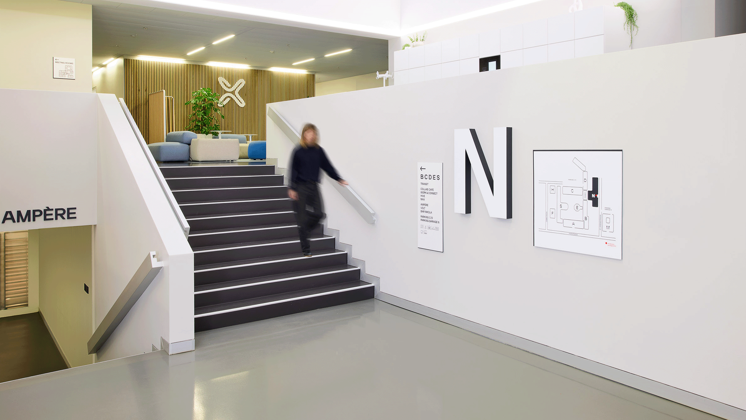
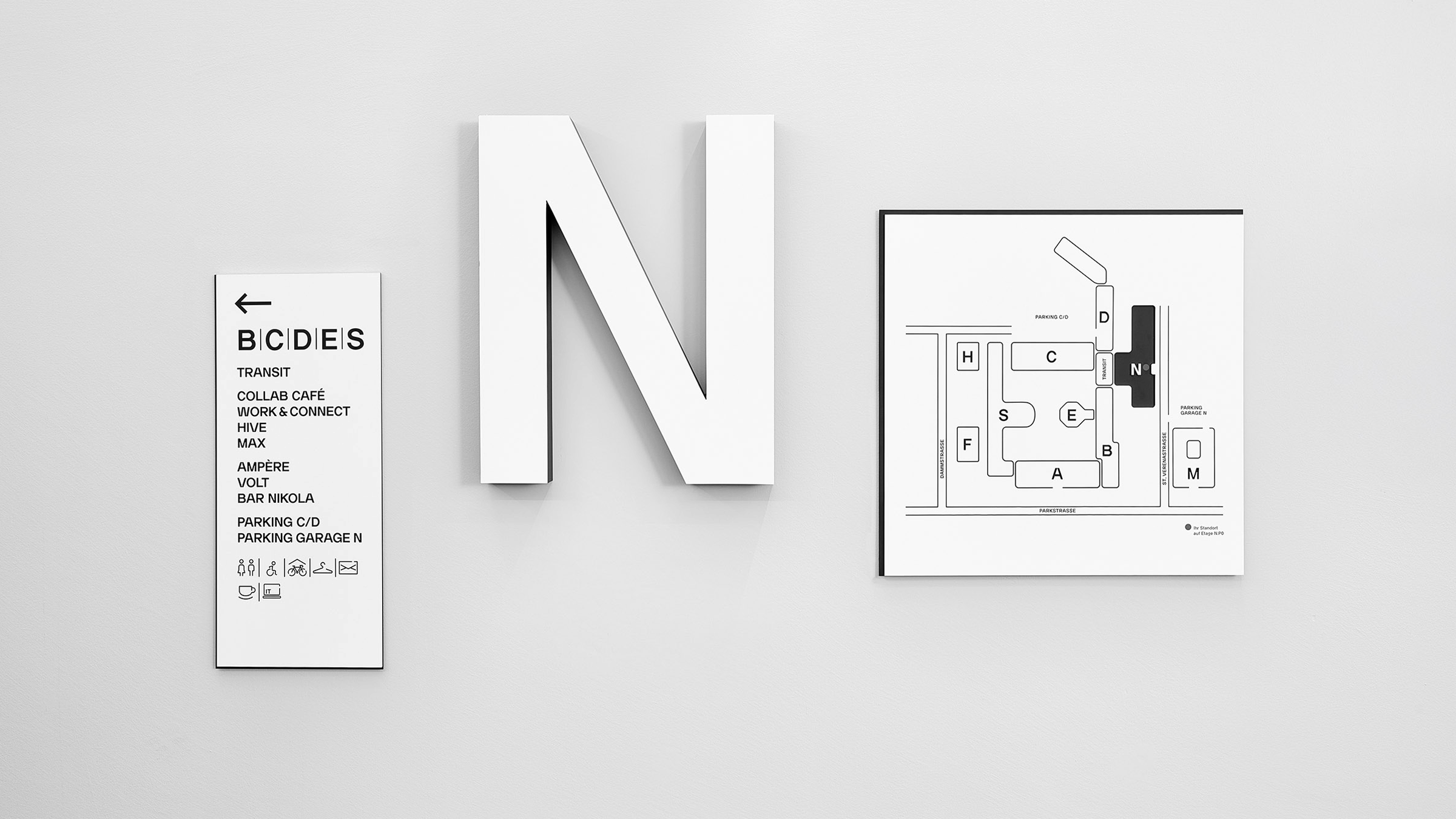
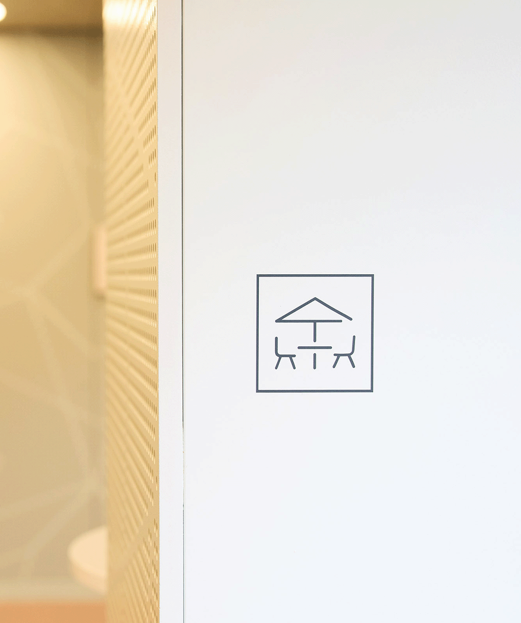
Large-format campus maps at the entrances provide orientation, while three-dimensional letters mark transitions and important areas. Destinations such as the Ampére restaurant or the Work & Connect zone are also clearly signposted. Standardised pictograms for tea kitchens, toilets and IT rooms ensure intuitive navigation.


Design and materiality
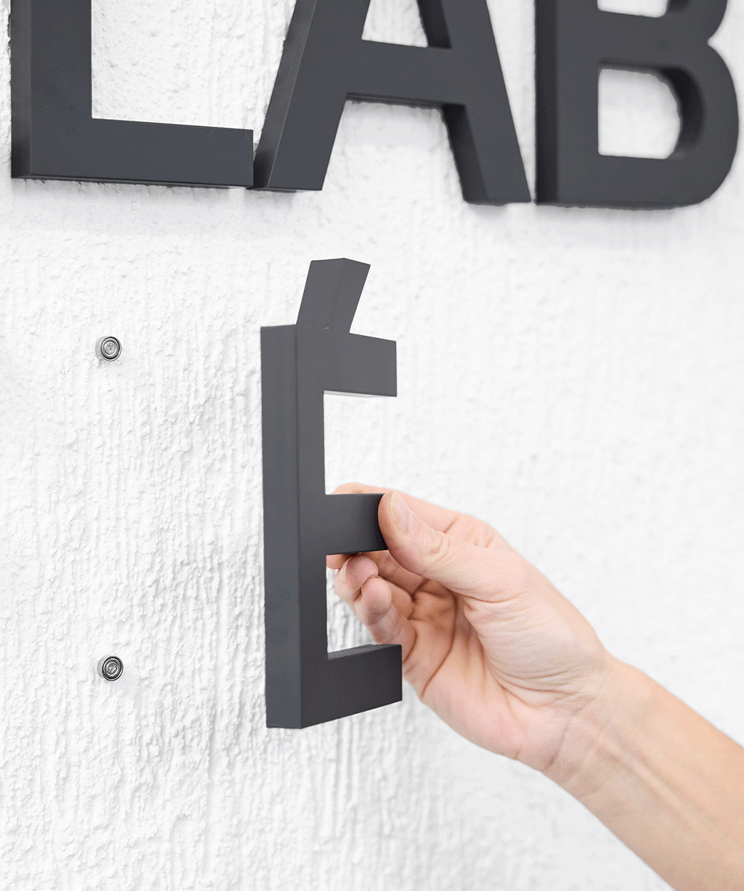
High-quality materials with milled and raised elements give the signage a modern feel and durability.
Realisation
Over the course of three years, four project managers worked together with an experienced signage planner to develop a sophisticated signage system. The implementation took place in two stages, during which over 170 signage elements were installed.
A campus with clear orientation
The new signage makes the Axpo Campus Baden intuitive to navigate and combines corporate design with functionality.
We use cookies on this site to enhance your user experience. By clicking any link on this page you are giving your consent for us to set cookies.