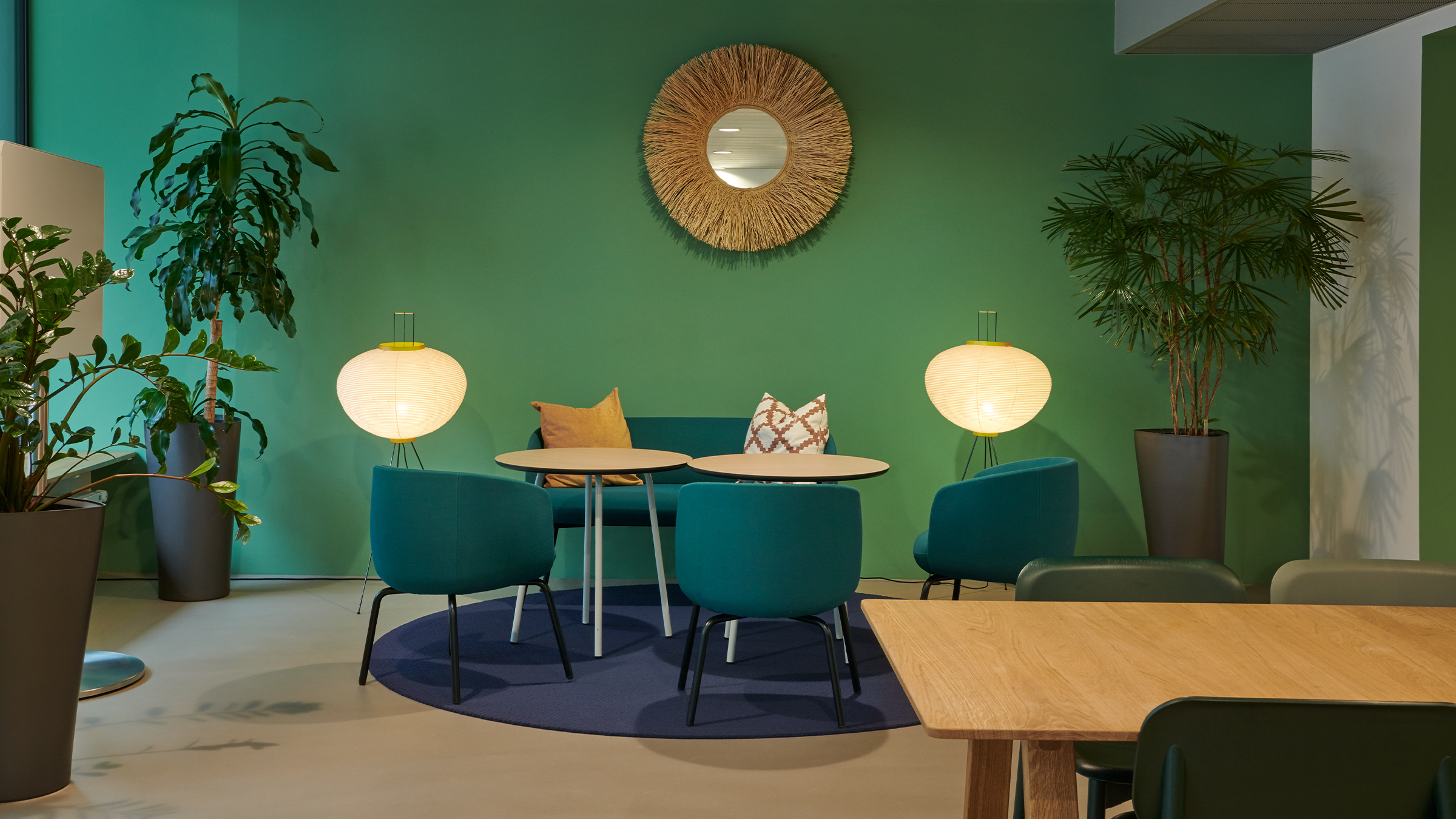
Upgrading of premises at headquarters
An Open Space System in brand design
The headquarters of Sanitas, the leading Swiss health insurance company, has been upgraded for employees through new zoning and selective design and architectural measures.
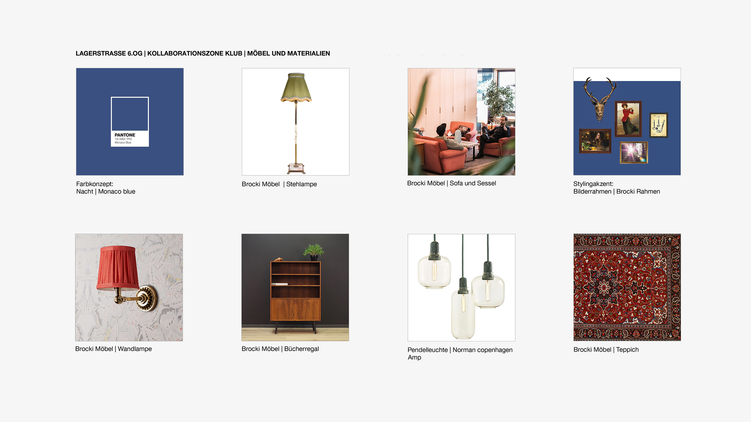
The spatial concept is based on the guiding principle that “the greatest wealth is health”. With the help of the theme-specific design and in line with the Sanitas corporate design, each floor and the rooms have their own identity.
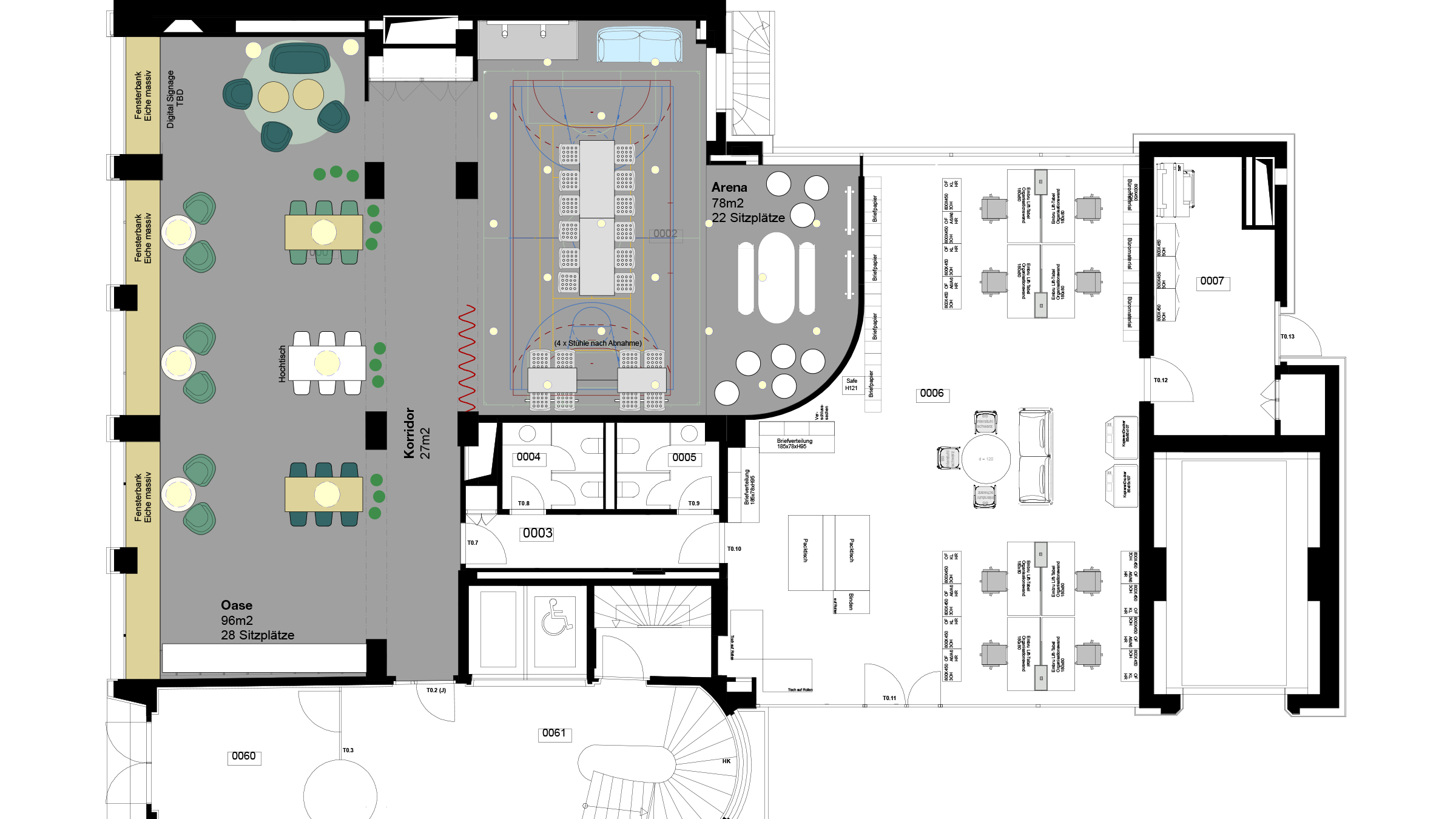
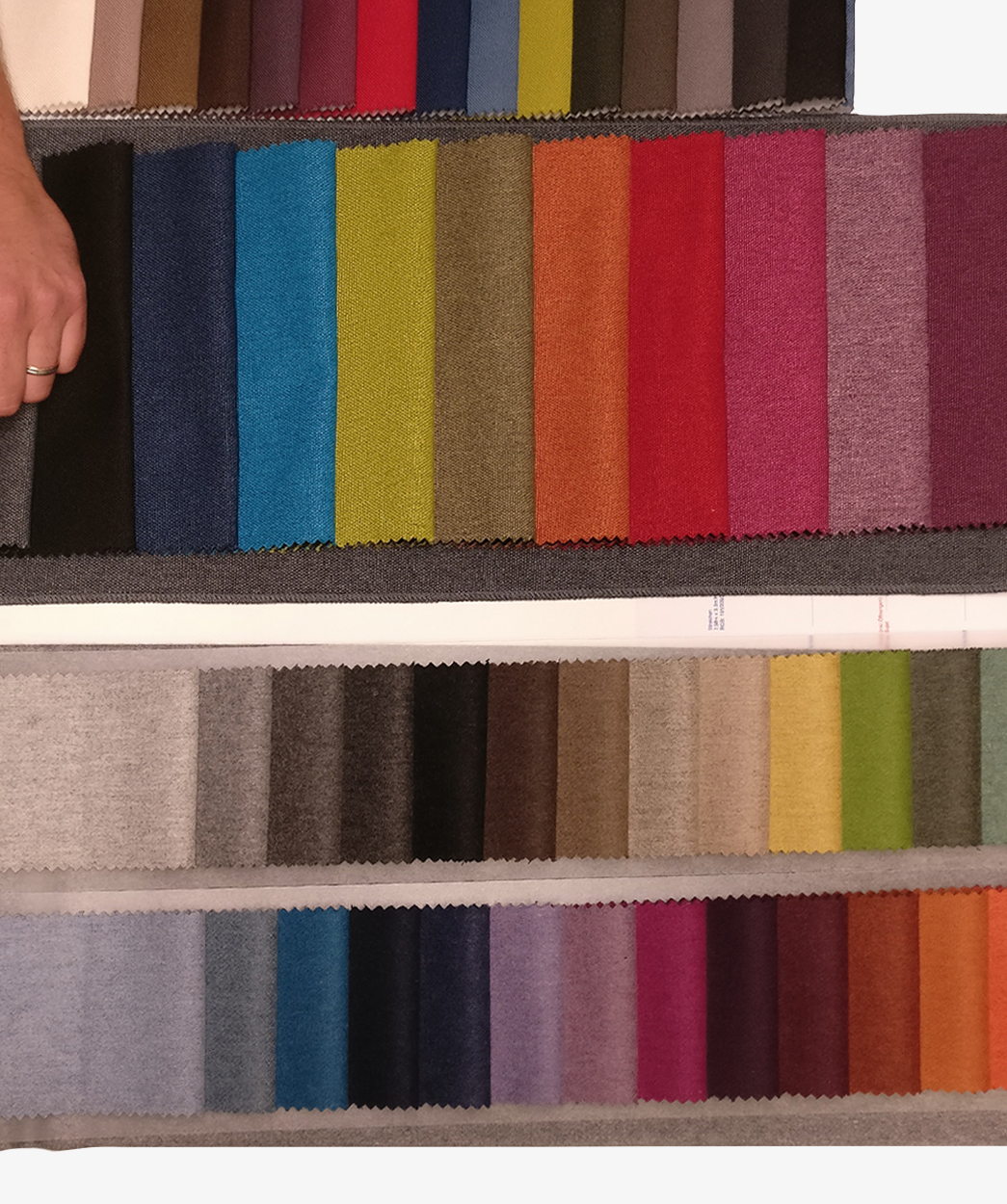
Designed as an open office, the fixed workstations along the window fronts, collaboration zones and temporary workstations are located in the middle section. Focus boxes for concentrated work or quiet telephone calls complement the work forms. A new plant concept not only creates a better room climate, but also blends in with the Sanitas colour scheme.
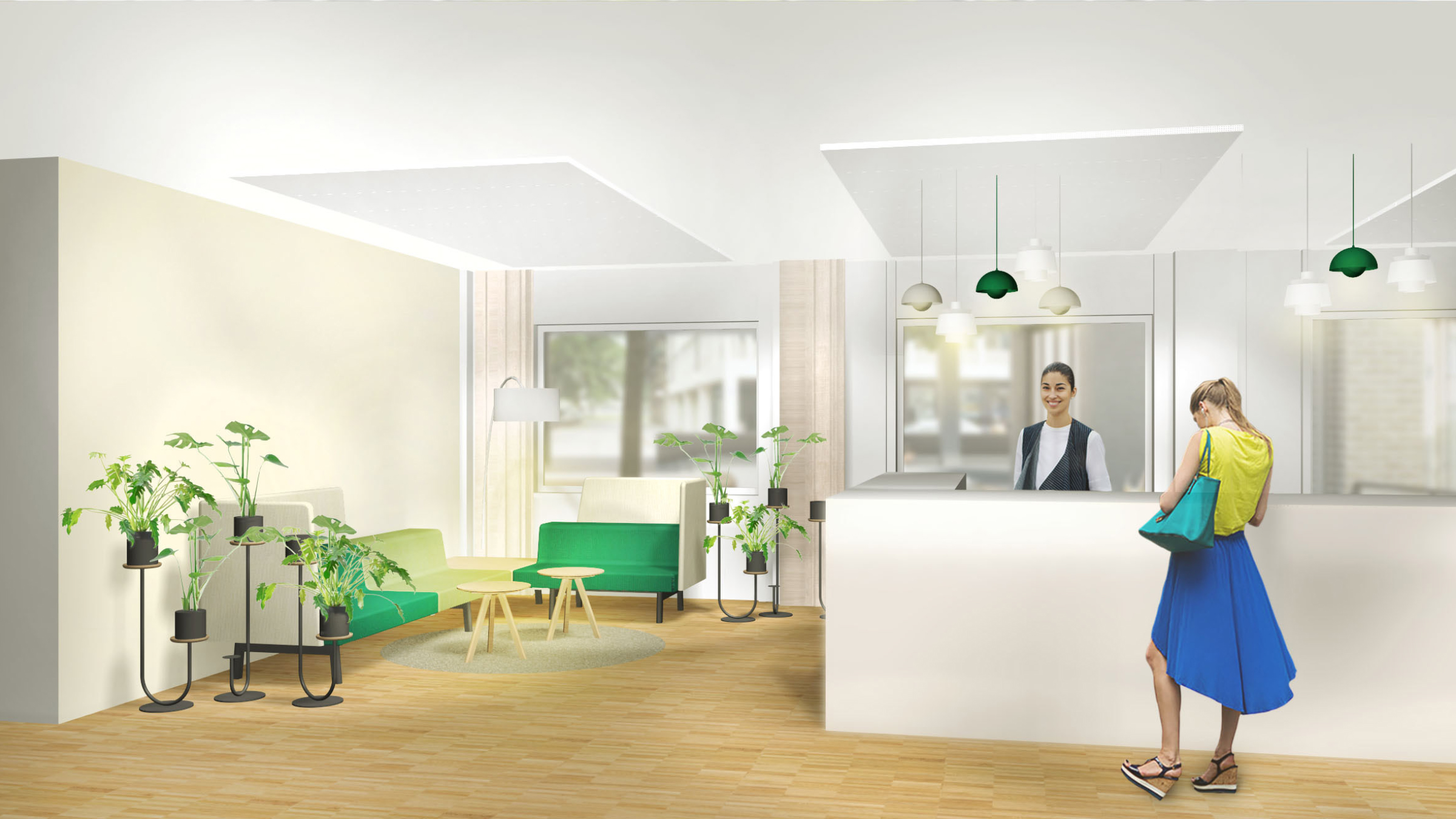
In addition to colour and theme-related accents in the open office, the meeting and retreat rooms, the cafeteria and the entrance areas convey the messages in the interior design: nature, health, urbanity and landscape can be experienced directly.
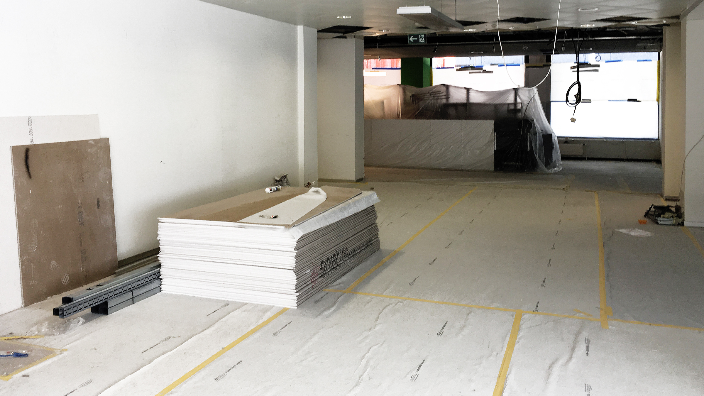
From the spatial concept to the implementation planning, an innovative and contemporary workspace on more than 5,000 square metres was created in close cooperation with the client and in less than four months.
Photos: Studio Willen

We use cookies on this site to enhance your user experience. By clicking any link on this page you are giving your consent for us to set cookies.